Orientu
Product design. 2019

Context
Orientu is a career assessment application. Its purpose is to help Brazilian students decide what they will study in college. The application is available for download at PlayStore and AppStore. This project was carried out in 2019, so there might be changes between the current version and what is presented here.
Orientu's recommendation system learns from activities in which the students may indicate hobbies, habits and preferences, and also through questions in which they’re supposed to judge information about different courses, jobs and career paths.
The project was informed by a comprehensive research in which we aimed to understand needs, anxieties and preferences of the young people that were about to begin their careers. Mainly, the focus was on describing our potential users; understanding which digital experiences make more sense to them; and on clarifying their expectancies when interacting with a product that proposes to help them in such a transition phase.
Design research
As we were creating a product from scratch, and considering I was the sole designer on the team at that time, my aim for this initial research was twofold. I wanted to establish a strong foundation for informing design choices and provide the business teams with valuable insights for planning various aspects of the service ecosystem. This research also offered a significant opportunity to initiate discussions about design processes within the team.
For this first research phase, I conducted face-to-face semi-structured interviews with teenagers aged 18 to 19, a pivotal time for career decision-making. I opted for interviews over surveys or quantitative analysis due to their exploratory nature. My intention was for these interviews to serve as the first step in building knowledge, providing quick insights to work on, and identifying gaps that could be addressed in future research sessions.
There was no previous research available in the company, and neither a established research practice. Thus, I also needed to figure out operational aspects such as compensation and recruitment.
Script and execution details
The interviews were guided by a script designed to uncover details about the users' daily routines, socioeconomic background, and digital behaviors. This included their favorite apps, preferred features, aesthetic preferences, and more. Additionally, we explored their top priorities when choosing between career options and educational institutions. We delved into their past decision-making experiences if applicable, and we also discussed their expectations and frustrations when using similar career assessment products.
These interviews were carried out by a team of two and were recorded for future reference. This ensured accurate information retrieval and analysis.
Key strategic takeaways
1. For the design of a more adequate digital experience:
Upon analyzing the narratives and beliefs shared by the users, we formulated initial descriptions that subsequently informed our design and product strategies.
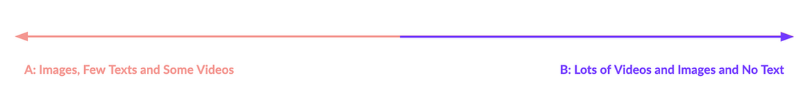
For instance, we successfully validated our assumption that potential Orientu users prefer digital experiences that are not primarily text-based. Moreover, we identified two key mental models of content consumption among users:
- Group A: This includes youngsters who prefer digital products with content presented predominantly through images, supplemented by minimal text sections.
- Group B: This consists of youngsters who have a strong preference for multimedia content and exclusively opt for digital experiences centered on videos and images.
The research not only yielded new content production and articulation guidelines but also unveiled users' preferred apps, which mainly included Instagram, WhatsApp, and YouTube. These apps provided valuable insights for shaping digital experiences.
2. In terms of creating a more precise recommendation system:
The research also highlighted that potential users of the product prioritize distinct factors and assess career options through different criteria. For instance, we identified three motivation categories among them: those who assess career options based on their economic potential (A), those who seek alignment with personal identity (B), and those who lack a clear direction and rely on existing hobbies and skills (C).
These motivation categories underscored the necessity of diversifying our recommendation system to genuinely assist the targeted individuals. Consequently, we began devising strategies to address this requirement.

3. Enhancing Content Organization and Creation:
Another significant insight was the distinct clusters of information users sought when making career decisions. In this initial session, our goal was to identify broad categories, rather than specific queries, to serve as foundations for diversification and alignment. By analyzing their decision-making journey (as shown below in Portuguese), we pinpointed specific aspects to prioritize further.

We learned and concluded that all doubts about courses and institutions that arose during the decision-making process could be organised through the following seven categories:
Before college:
Life and activities during graduation; which institution is best (perceived quality of higher education institutions); the educational biases of the same course across different institutions; and information about admission processes.
After college:
Career possibilities after college; compensation and economical stability provided by each career possibility; and how competitive each one of them is (is it hard to find jobs?).
4. At last, for a better way to help users and deliver the digital experience:
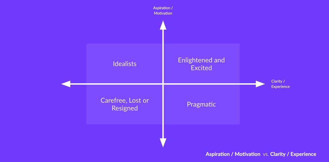
A key step involved creating clear mental models to classify users based on their motivations, clarity about career options, and what they prioritize when choosing careers (axes below). This was to make these variations evident, enabling us to design a product that could cater to diverse needs and paths.
Put simply, the research made it evident that we couldn't treat users uniformly. They have different backgrounds, realities, motivations, and experiences tied to their dream careers. For example, users that come from a family of engineers likely know more about the career, possibly focusing more on research college options than a typical compensation for the role. Similarly, treating users who are 90% decided the same as those with no clue isn't wise. Our aim was to create Brazil's top career assessment app, factoring in all these nuances.
The axes below categorize users by their career clarity, aspirations, and motivations. We used these to shape an onboarding experience that sorts users and offers more suitable assessment activities.


Key contributions for UX Design
The examples below illustrate how research results were translated into product aspects:
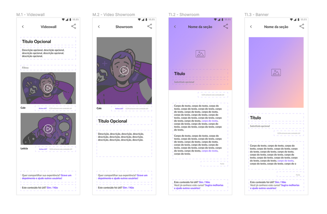
1. The design of components and content sections
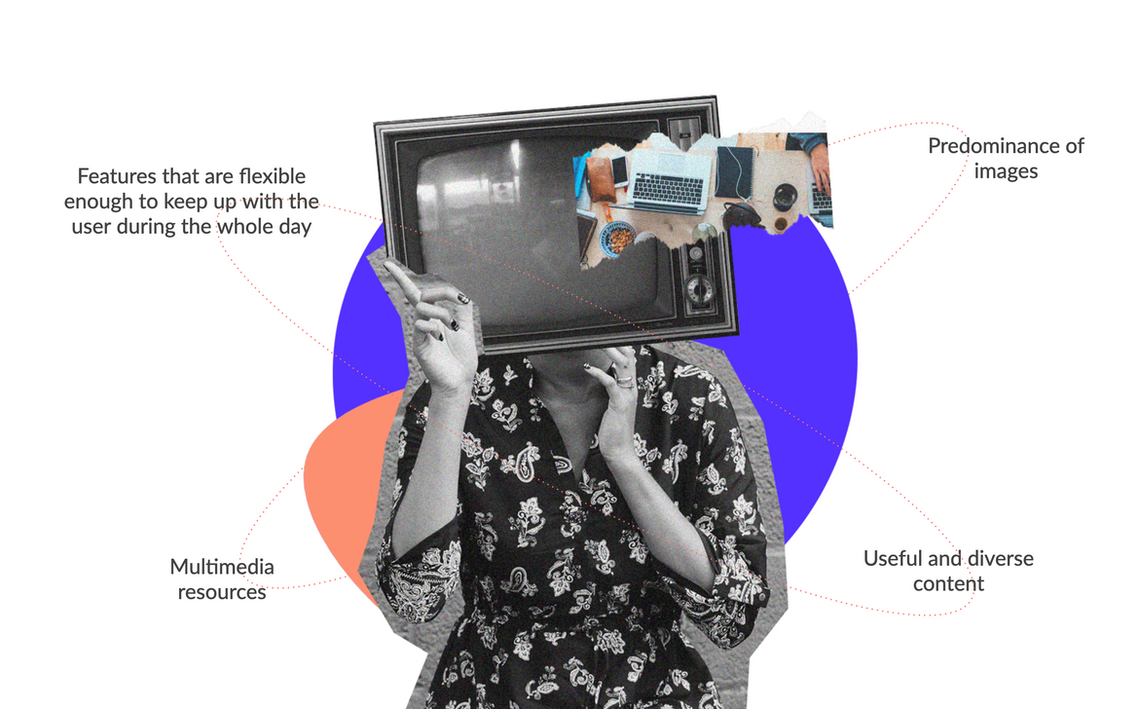
As mentioned, Orientu's users really prefer a visual approach with pictures standing out. We also realized that video content is essential to connect with the youth we're targeting. They emphasized the influence of friends and family (validation) on their decisions, so I designed shareable components and sections.
Moreover, interviews revealed that trustworthy information matters to our potential users. They criticized other career assessment platforms for lacking source information. I suggested incorporating a source section in our content component to address this concern.
Wireframes below are in Portuguese, but main elements can be identified.
2. The inclusion of an onboarding section to better sort our users
The results of the research also helped me prioritise the inclusion of an onboarding section within the team. The ideia was to design a first step in which users would answer some questions and hence be classified in one of our mental models.
The video below shows the final versions of sign up / login flow followed by the onboarding section.
3. The limitation in the number of assessment results
Interviews also showed us that career assessment product users often feel frustrated with results because they feel they are too generic. Users don’t really feel understood and considered. Thus, we decided to reduce the number of recommendations to address this feeling.
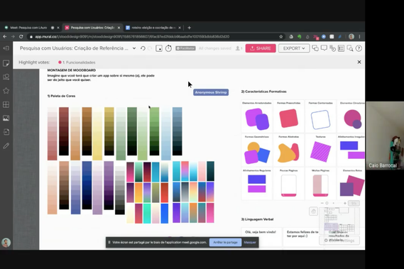
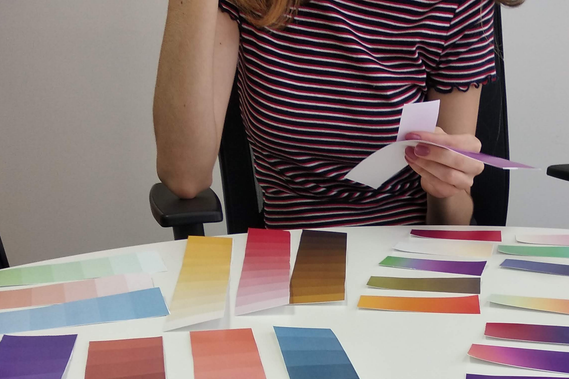
Extra in-person research for visual foundations
As we were creating the product from scratch with little to none existing visual guidelines, I suggested the execution of a generative research focused on visual design principles. I was the main facilitator, and was aided by another colleague of the team.
We invited 5 potential users to a 90-minutes creative session in the office and executed 3 extra online ones due to the beginning of the pandemics.
In this study, users were presented with many "visual aspects" such as color palettes, formative characteristics, textual language, and illustration styles. They were tasked with building their own app while voicing this process.
Insights were taken and applied into the design of the product.
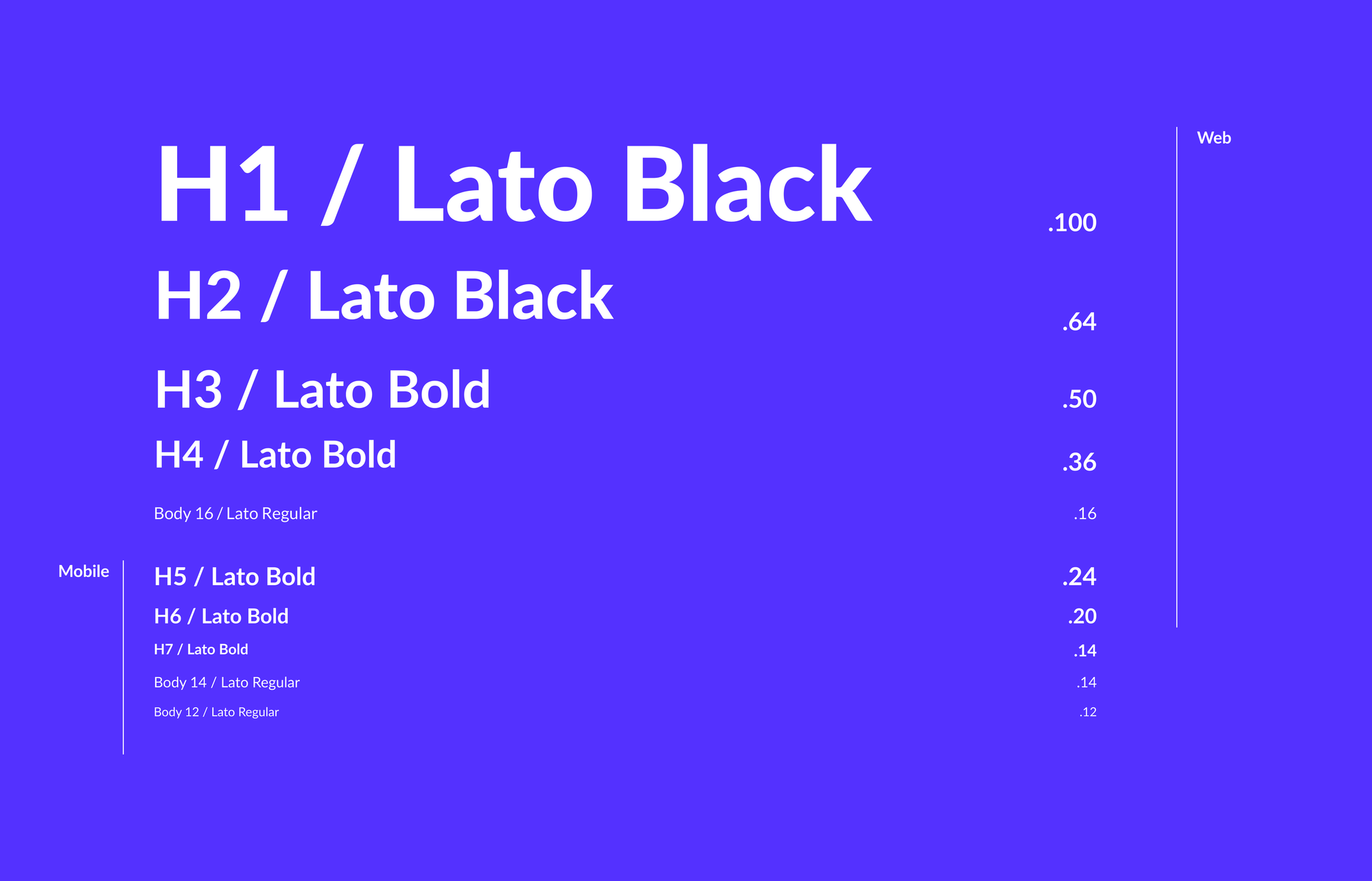
Visual foundations
We seeked to evoke trust and credibility. That's why Orientu has an overall organised and clean look. Elements are well-spaced and margins were set as to create room for breathing.
However, Orientu is still a product for the youngsters who are trying to decide their careers. That's why the intention was to evoke an overall professional look while also looking relaxed and friendly. Components have rounded corners, colors are vibrant and icons and illustrations were chosen as to reflect them.


The app
Unfortunately, the image of flow below is in low-quality and I've lost the originals. However, the navigation goes as follows: users enter the app and are prompted with a sign up or login area. If they are new users, they are taken to an onboarding flow, like mentioned before. Then, they are taken to the test and get to answer some questions for the algorithm to calculate the recommendations.
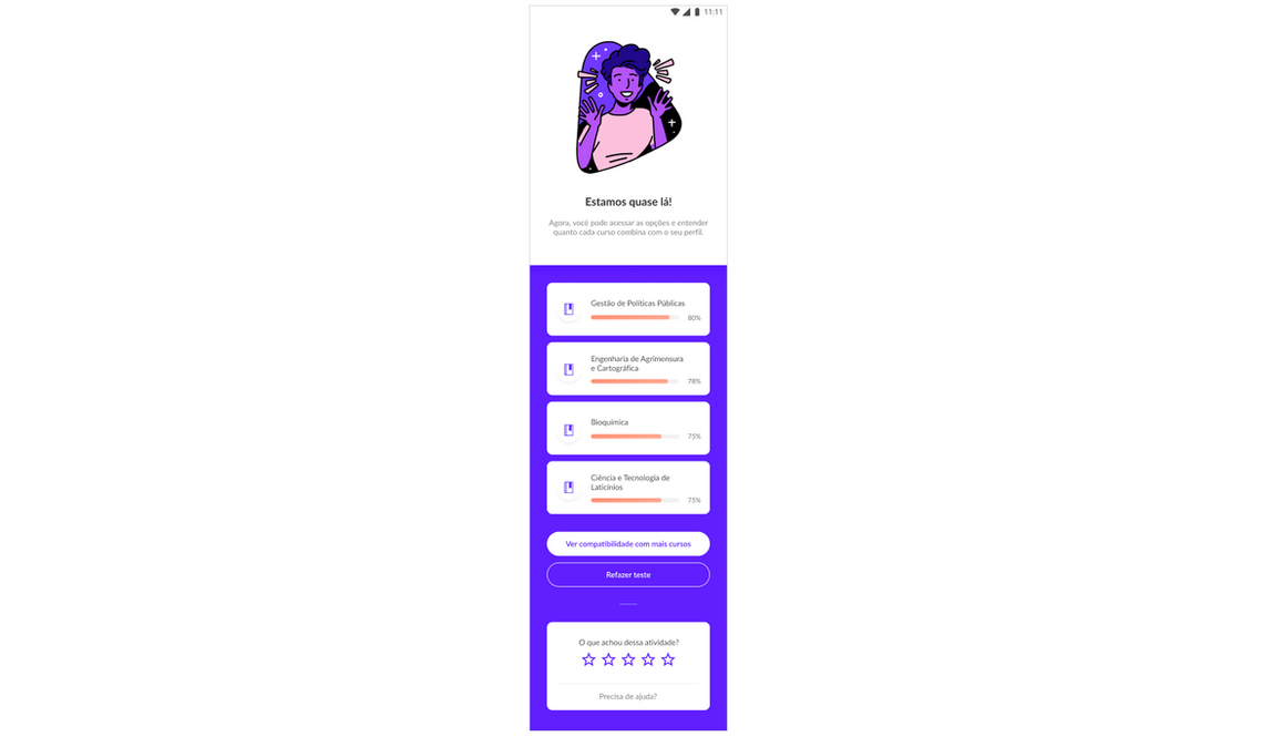
In the end, they are taken to the results screen, where they can check the options that have been recommended, check more details on each one of the courses individually, and evaluate the results. They can also re-take the test, access a help section, and share the results with their social networks.
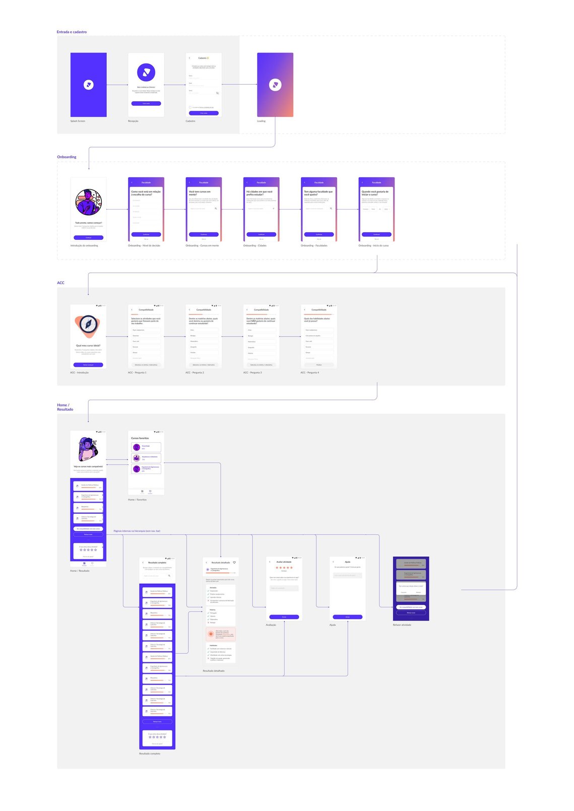
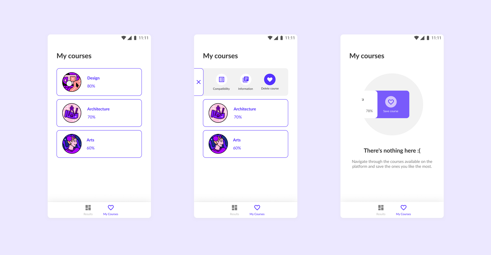
Key-components and key-screens


The app also contained a feature for saving courses. A "following" mechanism that allowed users to easily retrieve the information on the options they enjoyed the most, and opt-in for notifications on college institutions, exams and hints about the careers.
Reach out to me online for more details on this project! :)